
Category Analysis - Overview Page
The Overview page gives you a high-level snapshot. It covers Market Share, Share of Voice (SoV), Availability, and the supporting KPIs grouped under Traffic, Conversion, and Operations.
Performance Overview Widget
This is your headline section. It shows the three most important KPIs - Market Share, Overall SoV, and Weighted Availability - at the top. Below them, the rest of the KPIs are grouped under three lenses: Traffic, Conversion, and Operations.
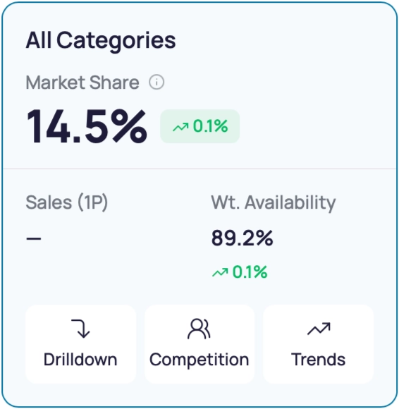
The All Categories card at the top shows your Market Share, Sales (1P), and Category Size across everything you’ve selected. Think of it as your single-number headline for the scope.
Each of the three lens cards below shows:
- A status pill (Good / Moderate / Poor) summing up health on that lens
- Three KPIs for the lens (e.g., Organic SoV, Paid SoV, Branded Search for Traffic).

For details on each KPI, see Performance Metrics Definitions.
From the Overview, you can move to the Traffic, Conversion, Operations, or AI Insights tab using the tab strip below the page title.
Category Performance Charts
The Category Performance chart shows how Market Share is moving across your selected categories, side by side.
- Each category has its own trendline. This makes it easy to spot when one category is gaining share while another is slipping.
- Use the icons in the top-right to switch between line and bar chart views.
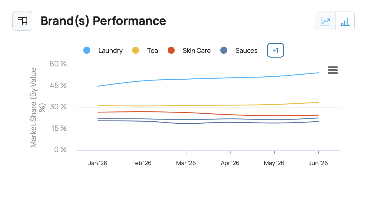
💡 Tip: Use the line view to spot trends. Use the bar view to compare sizes at a specific point in time.
Brandwise Distribution
The Brandwise Distribution widget shows how the category is split across brands. It groups brands into three buckets:
- Selected brand(s) - your filter selection
- Top 4 brands in the selected categories
- Others - every remaining brand combined
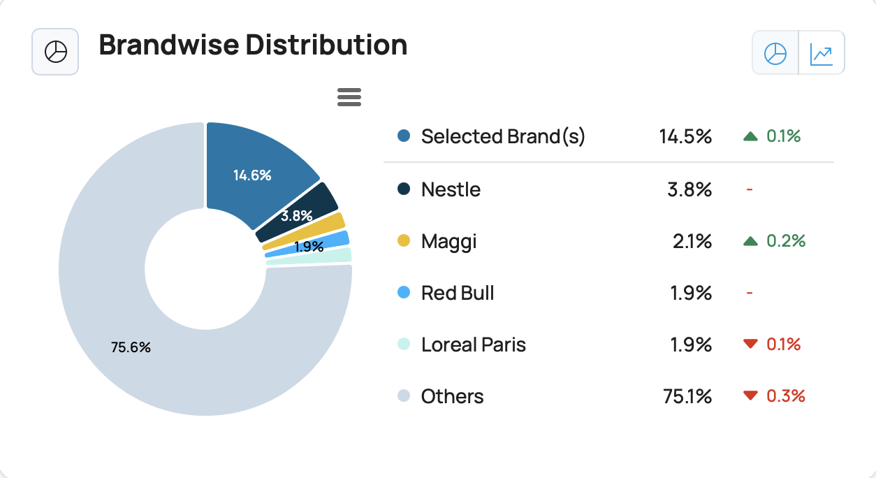
Switch between donut and trendline views to see either the current split or how it has shifted over time.
Sub-Category Performance
The Sub-Category Performance widget has two parts. A card strip on the left and an SKU table on the right.
Card strip (left):
- One card per subcategory. Each card shows Market Share and Category Contribution.
- Sorted by Market Share (high to low) by default. Switch the sort to Category Contribution using the dropdown.
- Use the Laggards / Leaders tabs to flip the ranking.
SKU table (right):
- Rows show the top SKUs in the chosen subcategory - both yours and your competitors.
- Columns include Market Share, Overall SoV, Weighted Availability, and Anomalies.
- Click a subcategory card on the left and the table highlights its 5 leader and 5 laggard SKUs.
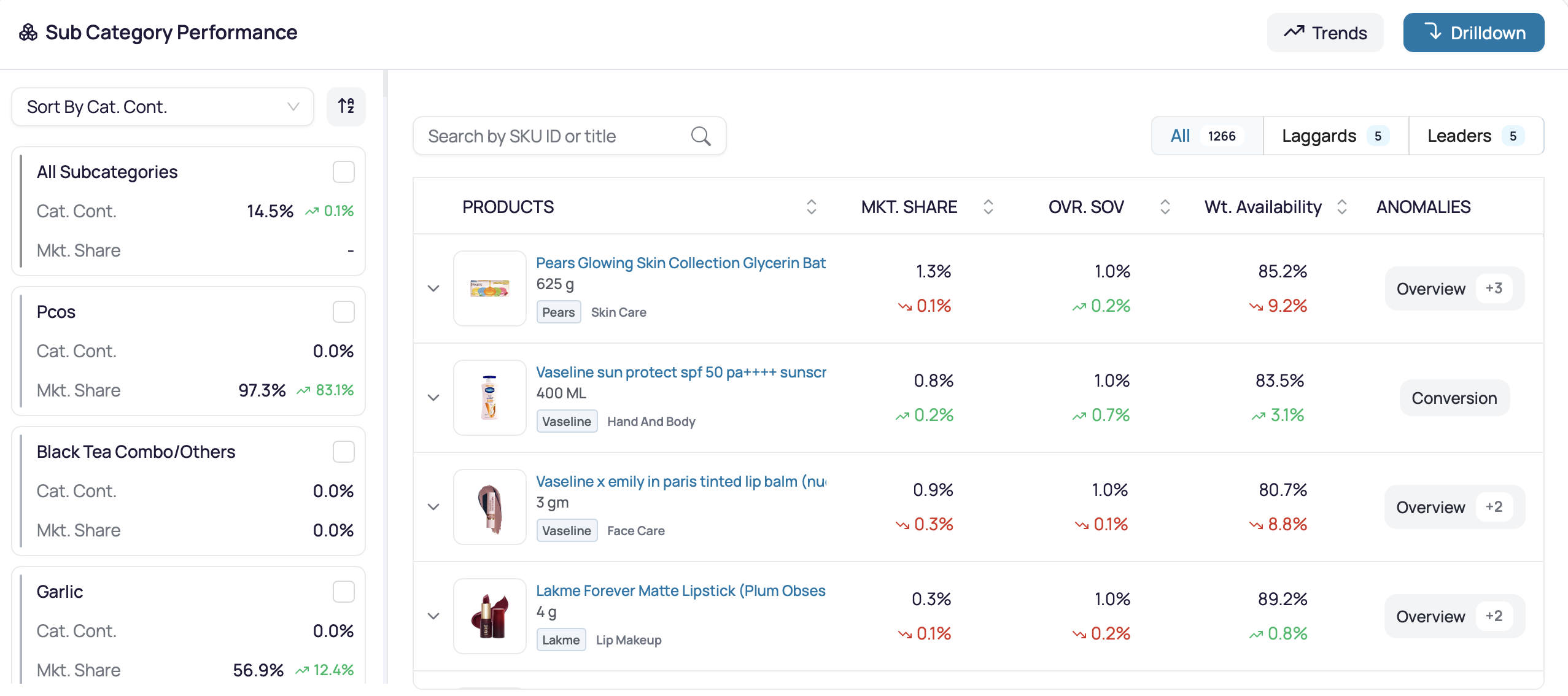
If no laggards show up, that’s Business As Usual (BAU) - nothing urgent needs attention.
Hover on any leader or laggard SKU row to open the Product Hover Card. The card gives you a quick view of the SKU’s image, price, rating, and shortcuts to deeper views. See Product Hover Card for details.
For a deeper look at any subcategory, click Drilldown in the top-right of the widget. This opens the Drilldown sidebar. See Drilldown Views for the full reference.
Regional Level Performance
The Regional Level Performance widget works like the Sub-Category widget, but with regions on the left and subcategory metrics on the right.
- Cards on the left show Market Share and Regional Contribution for PAN India and each major region (Mumbai, Delhi NCR, Bengaluru, Hyderabad, Kolkata, Rest of India).
- Sorted by Market Share by default. Switch to Regional Contribution from the dropdown.
- Click a region card to highlight its 5 leader and 5 laggard subcategories.
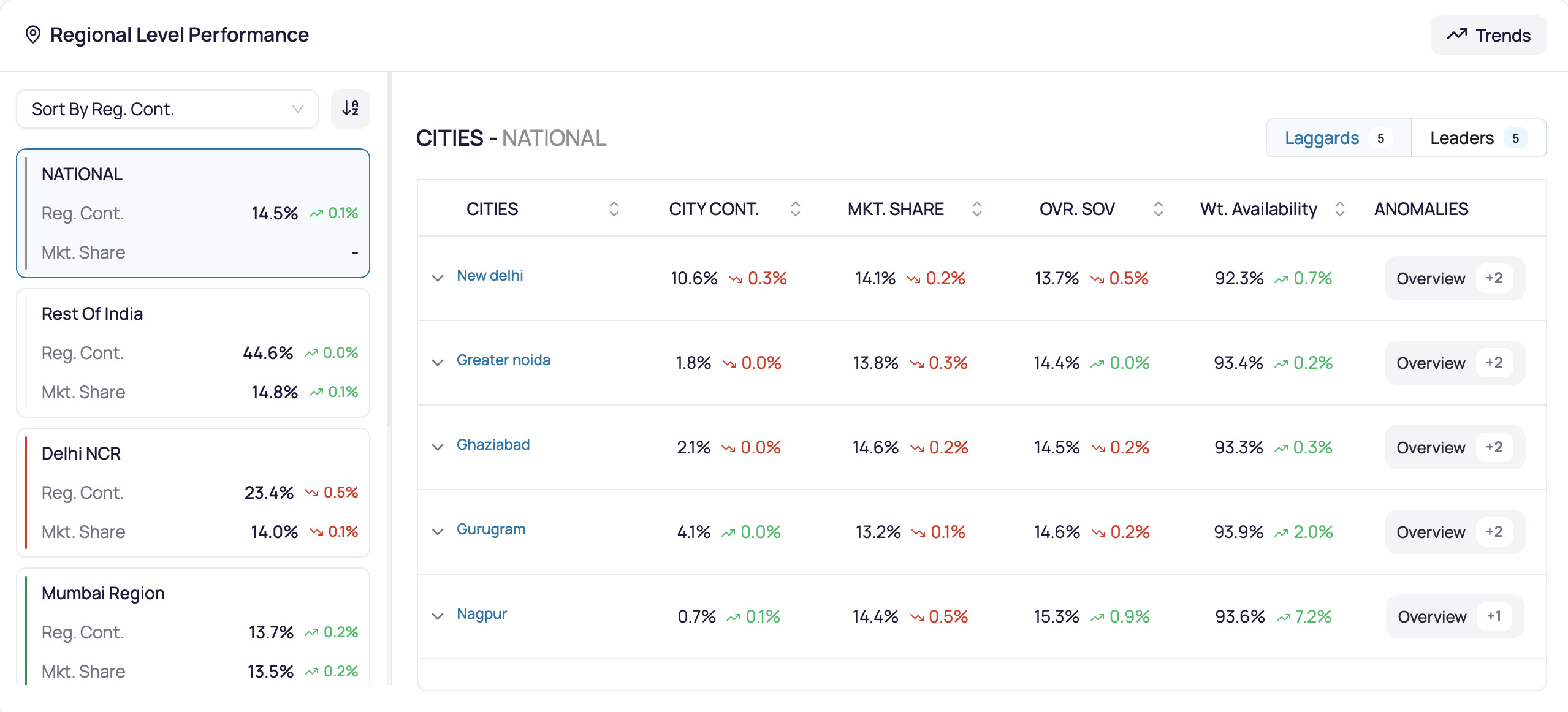
If no laggards show up, that’s Business As Usual (BAU).
Click Drilldown to go deeper - for example, Gurugram inside Delhi NCR. You can also view performance at the city level .